
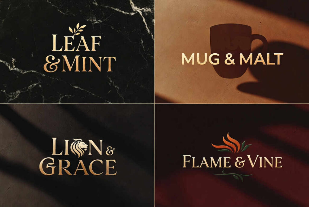
In the crowded landscape of modern consumer brands, a quiet but powerful naming convention has emerged: the elegant pairing of two concrete nouns joined by an ampersand. Tuft & Needle. Boll & Branch. Loom & Leaf. These are not random inventions or abstract portmanteaus. They are deliberate, evocative constructions that whisper craftsmanship, heritage, and balance while projecting premium quality in a digital-first world.
This “X & Y” format—often rendered with the stylized & symbol—has become especially prominent in the direct-to-consumer (DTC) bedding and home goods boom of the 2010s and beyond. It offers a masterclass in branding psychology: it feels simultaneously timeless and fresh, artisanal and accessible, specific and expansive. The trend draws from deep wells of linguistic tradition and visual design, helping new brands signal authenticity at a moment when consumers are skeptical of hype and hungry for substance.
The Bedding Trifecta: Craft and Nature in Three Names
The mattress and bedding category provides the clearest cluster of this naming strategy. Consider the pioneers:
Tuft & Needle (founded 2012) disrupted the notoriously opaque mattress industry with transparent pricing, a 100-night trial, and a simple foam mattress. The name itself is a direct nod to traditional mattress-making techniques—tufting (the process of pulling fabric through layers with buttons or ties) and the needles used in that handcraft. It positions the brand as returning to honest, no-gimmick construction rather than marketing-driven features. The result was a brand that felt both innovative in its DTC model and rooted in physical making.
Boll & Branch (launched around 2014 by Scott and Missy Tannen) took a similar approach in the sheets and bedding space, emphasizing GOTS-certified organic cotton and Fair Trade standards. “Boll” refers to the cotton boll—the seed pod that produces the fluffy fiber. “Branch” evokes the natural structure of the cotton plant or, more poetically, the branching out of quality from earth to finished product. The name grounds the brand in agricultural reality and natural purity, differentiating it from synthetic or conventionally farmed competitors. It became one of the early success stories of premium organic DTC bedding.
Loom & Leaf, Saatva’s ultra-premium memory foam offering, continues the pattern. “Loom” conjures traditional textile weaving and the organic cotton cover that encases the mattress. “Leaf” suggests natural elements, growth, and perhaps a lighter environmental footprint. Even though the core is advanced memory foam, the name wraps the product in imagery of handcrafted textiles and organic comfort. It helps Saatva’s luxury positioning feel connected to heritage craftsmanship rather than purely technological.
These three brands did not copy one another blindly. They independently arrived at the same structural solution because the format solves multiple branding problems at once: it is memorable, ownable, descriptive without being literal, and visually distinctive when the ampersand is stylized in logos and packaging.
Beyond Bedding: A Broader Pattern of Craft Heritage
The same logic appears in other categories where trust, story, and perceived authenticity matter.
rag & bone (founded 2002, gained prominence later) took its name from the old British term for itinerant “rag-and-bone men” who collected unwanted household items and sold them onward. The founders, with their love of British tailoring and bespoke quality, used the name to signal reclamation, craftsmanship, and turning raw materials into something valuable. The & reinforces the dual heritage—rag (fabric scraps, improvisation) and bone (structure, tailoring foundation). It feels simultaneously gritty and refined, perfectly aligned with premium denim and contemporary tailoring.
Salt & Straw (founded 2011 in Portland) uses the name to evoke the historical method of making ice cream: hand-cranking in a container surrounded by salt and ice, then packing the finished product in straw for insulation. In an era of industrial ice cream, the name immediately communicates small-batch, artisanal technique and old-world care. It has helped the brand expand nationally while retaining a story-driven, neighborly identity.
These examples reveal the deeper pattern. Successful “X & Y” names rarely use random or purely poetic words. They pull from the actual materials, processes, or historical contexts of the category. The conjunction “&” (or “and”) implies balance, partnership, or necessary duality—tuft and needle, boll and branch, salt and straw. The product is not one thing; it is the harmonious result of complementary elements.
Do you need a premium brand immediately, with an available .com?
Buy Now for instant domain name acquisition
Buy OakAndLoft.com
Buy LeafAndMint.com
Buy FlameAndVine.com
Buy LionAndGrace.com
Buy MugAndMalt.com
Why the Ampersand Works So Well Right Now
Branding experts have noted a broader resurgence of the ampersand in logos and visual identity. It is not merely decorative. The symbol carries rich connotations:
- Partnership and permanence: Historically used in company names to denote enduring collaborations (think Johnson & Johnson, Ben & Jerry’s, or older firms like Marks & Spencer). It suggests “this plus that equals something greater.”
- Brevity and digital friendliness: The & takes less space than the word “and,” making logos cleaner and more legible at small sizes—critical for app icons, social media, and packaging.
- Human warmth: In a world of sans-serif minimalism and cold digital interfaces, the ampersand’s organic curves feel inviting and reassuring. It softens the brand.
- Timeless elegance with creative freedom: Type designers enjoy the glyph’s flexibility. There are few strict rules, allowing for stylized, custom versions that become brand assets in their own right.
In the DTC era, new brands faced a credibility gap. Consumers had grown wary of flashy marketing and “disruptive” claims. A name like Tuft & Needle or Boll & Branch sidesteps hype. It says: We are not inventing something from nothing. We are refining something real—mattress construction, cotton growing, textile traditions—and bringing it directly to you.
This approach also aids memorability and word-of-mouth. Two strong, concrete nouns linked by & create natural rhythm and alliteration in several cases (Tuft & Needle, Boll & Branch, Loom & Leaf). They are easy to say, spell, and search.
The ampersand’s deeper advantages—its historical weight, visual charm, and ability to signal balanced quality—suggest staying power. As branding moves further into AI-generated names and abstract concepts, the return to tangible, craft-rooted pairings offers a counterweight. Consumers continue to reward brands that feel grounded in something real.
The trend also reflects a larger cultural moment: a desire for reconnection with making, materials, and honest processes after decades of abstraction and globalization. Whether it is a mattress tufted with care, sheets grown from certified cotton bolls, or ice cream made with historical technique, the “X & Y” name promises that the final product is the sum of worthy parts.
In branding, as in life, sometimes the most powerful statement is not a single invented word or a clever portmanteau, but two honest elements joined together. The ampersand does not just connect letters—it connects ideas, traditions, and the people who make things with the people who use them.
Sources and Further Reading
- “The Newest Logo Trend Is A Classic & For Good Reason,” The Brand Contrast (thebrandcontrast.com) – detailed analysis of ampersand resurgence in logos, historical context, designer perspectives, and benefits for digital branding.
- Boll & Branch official site (bollandbranch.com/pages/about) – company history, organic and Fair Trade certification details, and founding story.
- Salt & Straw official site and related coverage – explanation of the name’s reference to traditional ice cream-making methods.
- Company and review sources on Tuft & Needle and Loom & Leaf (tuftandneedle.com) – product positioning and naming context within the DTC mattress movement.
- Wikipedia and brand background on rag & bone – origin of the name from historical “rag-and-bone men” and British tailoring heritage.
These sources informed the historical, linguistic, and strategic analysis while the core observations on the naming trend derive from pattern recognition across successful consumer brands.